Entertainment
Why Is Every Pop Star Using The Same Sans Serif Font?
The simple typeface is more than just an artistic choice.
Open almost any designer coat in a department store, and you’ll find the brand in slim, Helvetica-style font. This trend was first named “blanding” in 2018, and the gist is that anonymous branding means ostracizing fewer people, which means more customers and, ultimately, more sales. In the last year, however, I’ve noticed this trend bleed over from luxury goods to album covers, the pioneer (and outlier, as you’ll see) being Brat. The dance-pop girls of today, including Dua Lipa, Rosé, and Jisoo, are all opting for nondescript sans serif typeface for their projects, designed to look vaguely aesthetically pleasing and (most importantly) polarize no one.
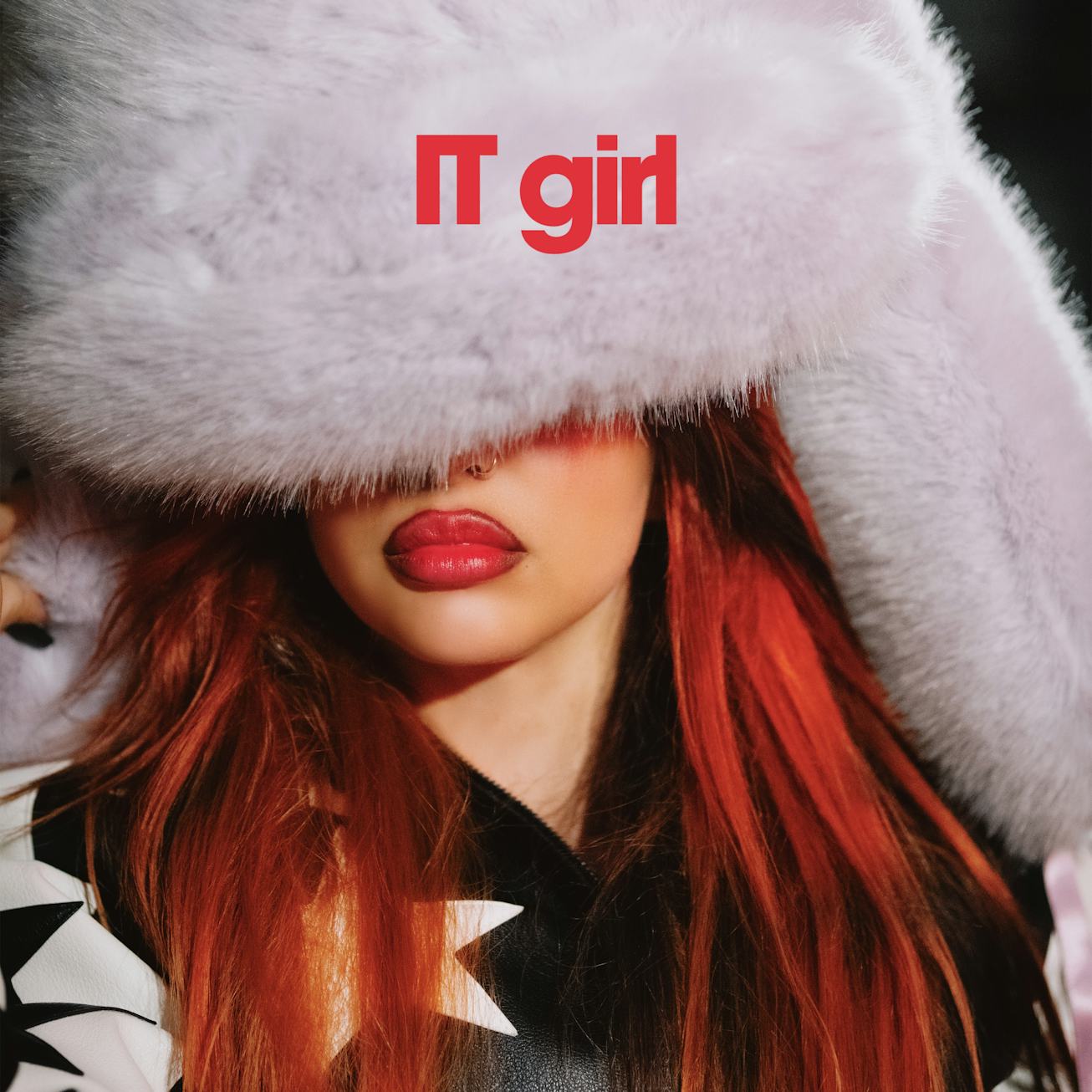
Indeed, Dua’s Radical Optimism single covers, including “Houdini” and “Training Season,” all use easily replicable Arial font. Rosé’s Rosie album art features slightly more rounded wording, but bolded and stamped right on the image just the same. Jisoo released a mysterious video teasing her comeback single with her name in anonymous sans serif. Jade’s fourth solo single, “IT girl,” has simple, blocky letters in scarlet red on its cover art. The lack of cursive or futuristic typeface suggests they want to be easily understood and not come off as smarter or better off than their listeners. In the same way that brands like Burberry sanded down the edges of their logos to reach a larger and less fashion-conscious audience, pop stars are hell-bent on being perceived as “one of the girls,” for fear of being canceled or too unrelatable.
If the Arial-ism of pop has a predecessor, it’s Charli XCX. Yes, these girls and their teams were most likely formulating these artistic decisions at the same time, but Charli honed in on Brat’s aesthetic in early 2023. Whereas the other album covers are universally appealing, Brat is nauseating, its custom sans serif cover intentionally blurred. Even the brutalist set design for her Brat tour features “PARTY GIRL” typed across the stage. Instead of being inoffensive, it’s so in your face as to be almost off-putting. Charli seems to have guessed that some people would disregard the album due to neon-green-induced headaches, but that’s the point. The true fans stayed, and she ironically made herself more relatable than ever with searingly real lyrics about being a girl (so confusing, right?) and feeling out of place in the music industry.
In a sea of endless content meant to appeal to everyone, artists are arguably doing themselves a disservice by smoothing out their imperfections. Charli gave a masterclass in minimalism with a message, with aesthetic choices that affront rather than soothe. If Brat summer has taught us anything, it’s to embrace the nuances and be brave enough to be yourself: Do that, and the right crowd will follow. It may not be the biggest audience, but with so much Helvetica flying around, it’s harder to differentiate who’s really being themselves and who just wants to lure in listeners by trying to appeal to all of them. And wouldn’t you rather be everything to some people instead of something to everyone?