The Fashion Issue
Stop Wearing Black! Color Is Back.
We’re entering the most colorful era in recent memory. How did we get here?
It all started with a pair of capris. The date was Sept. 26, 2025, the place Milan, and the occasion: Versace’s Spring/Summer 2026 runway. It was one of 12 runway debuts for a new designer during the season of the great creative-director musical-chairs game, but to say Dario Vitale’s show for the brand was the most talked-about show of the month would be an understatement; immediately, it became one of the most dissected runways of the 2020s.
The first look summarized his short-lived thesis for the brand, with a royal-blue cotton bomber jacket worn over a layered red-and-cornflower-blue shirt-tank-top hybrid, paired with sea-foam-green capri pants and metallic peep-toe sandals. It was part prep, part ’80s maximalism, part Gianni Versace, and yes, it was colorful as hell. Detractors and critics were divided on his bold new vision of sexuality and embellishment for the brand, but after seeing the way Vitale’s striking color combinations impacted the Fall/Winter 2026 runways and the wardrobes of our favorite style stars, it’s official: Color is so back.
The 2020s have become synonymous with “quiet luxury” — a phrase we at NYLON have personally put an editorial ban on — and the low-key, muted tones found on the likes of Kendall Jenner, Zoë Kravitz, and Hailey Bieber. The uniform de la saison was greige, with an emphasis on wardrobe staples meant to last a lifetime. Color was reserved as a proverbial cherry on top: a red sweater slung over one’s shoulders, a fashionably muted jade-green accent bag, or a bold purple shoe. Search up “pop of color” and you’ll find many of the same outfit formulas. But as always, fashion is fickle, and just as soon as we’re getting comfortable in our whites, grays, and blacks, one Italian man shocked us all into thinking about color in an entirely different way.
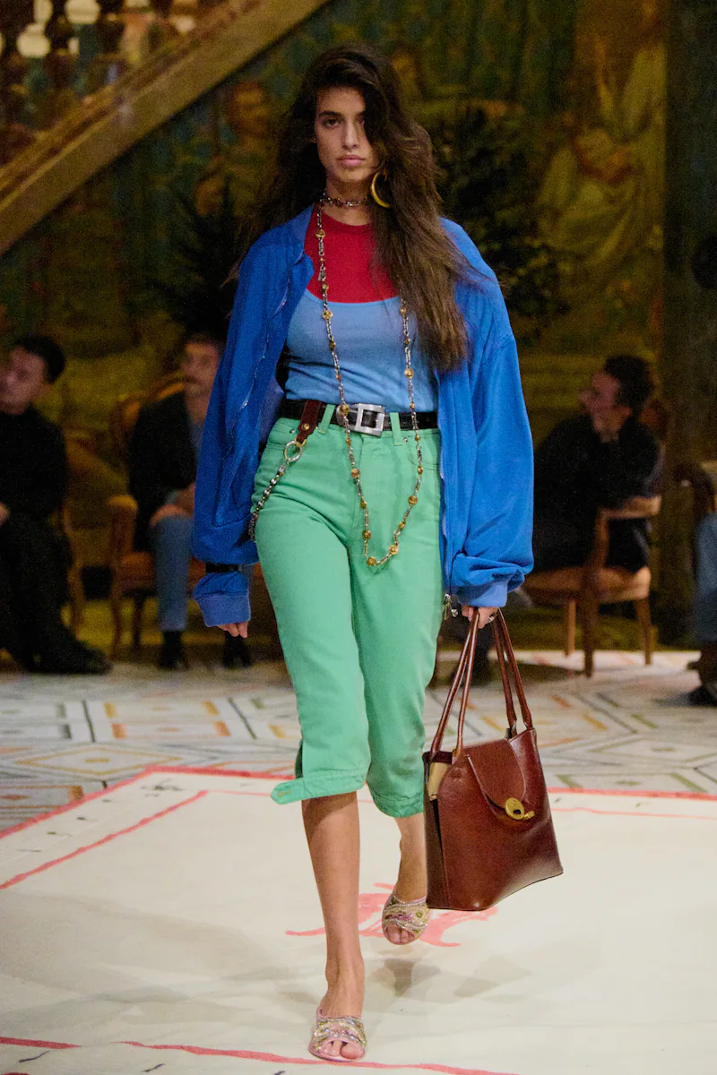
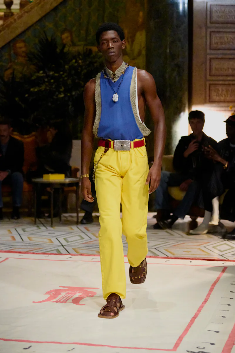
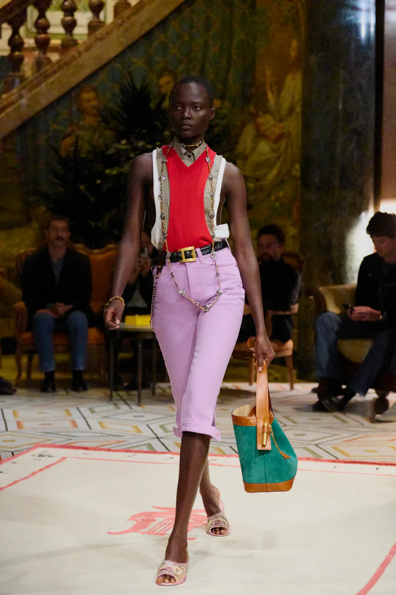
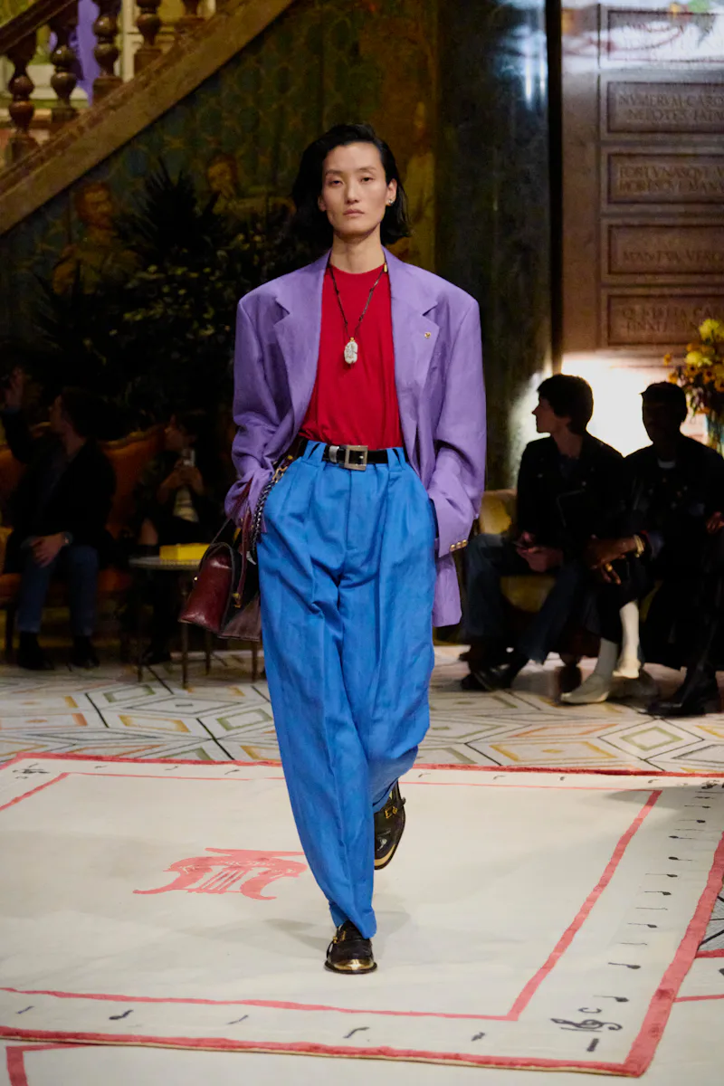
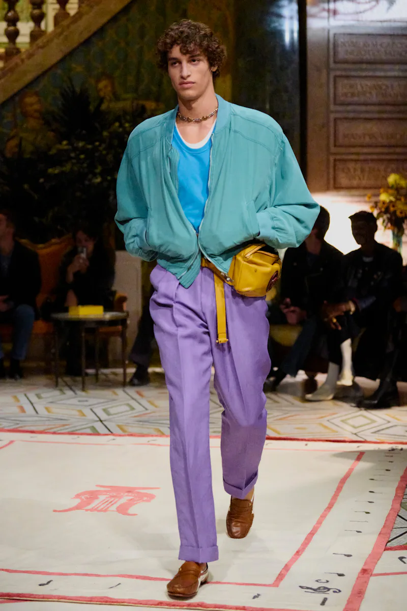
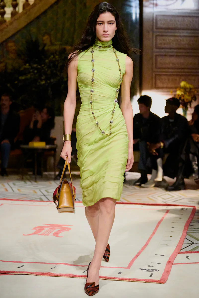
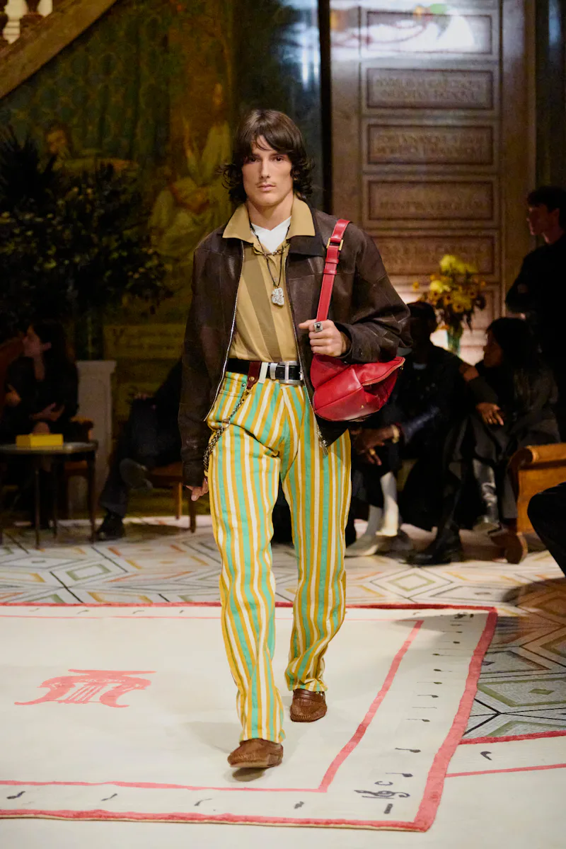
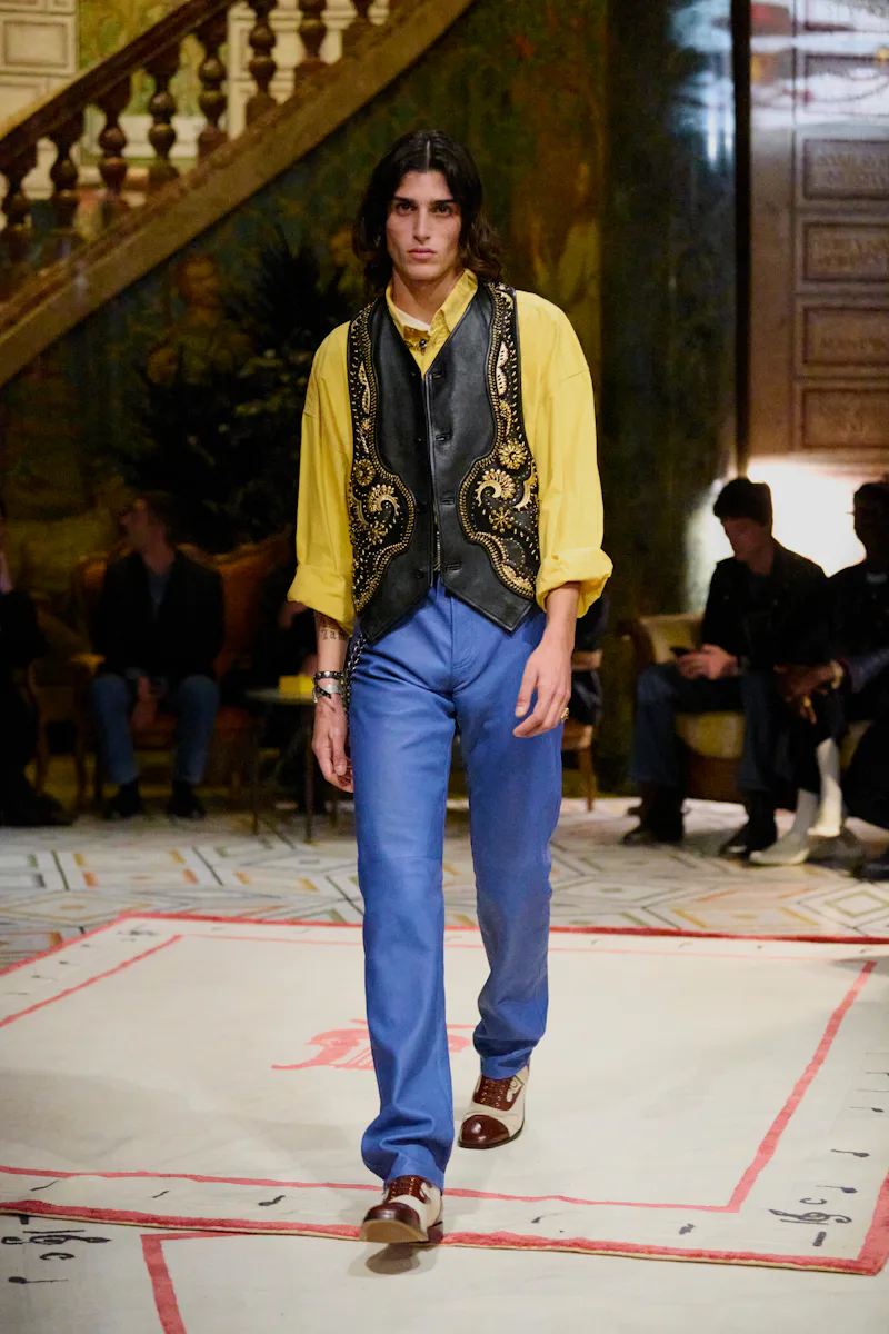
The rest of Vitale’s runway show provided a blueprint for the way we think about color now. His hues were solid, mixed and matched — teal, neon blue, and lilac; red, green, and blue — and not afraid to be jarring. It was ’80s power dressing with a preppy twist, relying on colors that were electric but not bright, landing somewhere between saccharine pastels and loud neons. The specificity is what won the day. I’ll admit I wasn’t sold on his propositions on first or second viewing, but after seeing the way it was received in stores — editors and influencers alike ravaged the racks, second only to Matthieu Blazy’s Chanel mania — and how people styled the pieces in real life, I became convinced that we all needed an injection of technicolor into our lives.
Of course, there are obvious predecessors and practitioners of color-blocking and clashing that deserve their praise. Dries Van Noten is perhaps the best living colorist, making disparate hues of burgundy, hot pink, and green feel right at home with one another. His successor, Julian Klausner has ably carried that torch with shows that tap into our colorful desires. On the stripes end of things, Christopher John Rogers is the American with the pattern on lock; his expert knitwear and striking taffeta color choices are world-class and odd enough to earn a permanent spot in your wardrobe.
After seeing the color explosion take over top closets around the world, it was only a matter of time before we saw rainbows everywhere. Men’s fashion week in June 2026 saw Auralee continue to perfect its color combinations, and even Jonathan Anderson at Dior couldn’t resist baby-pink trousers. The Fall/Winter 2026 womenswear runways were an equally audacious expression of color, from the bold, wacky styling at New York’s Zankov to the brilliance of Meryll Rogge’s debut Marni show that paired a traffic-cone-orange dress with a hunter-green parka.
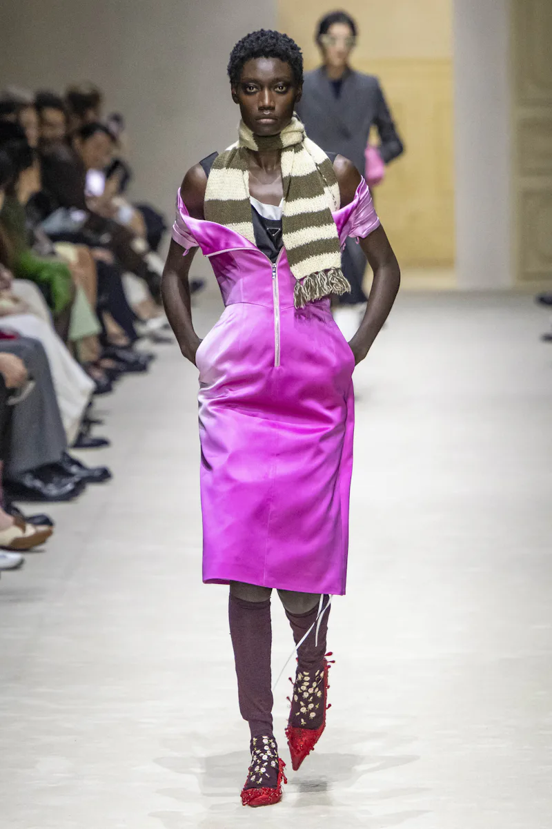
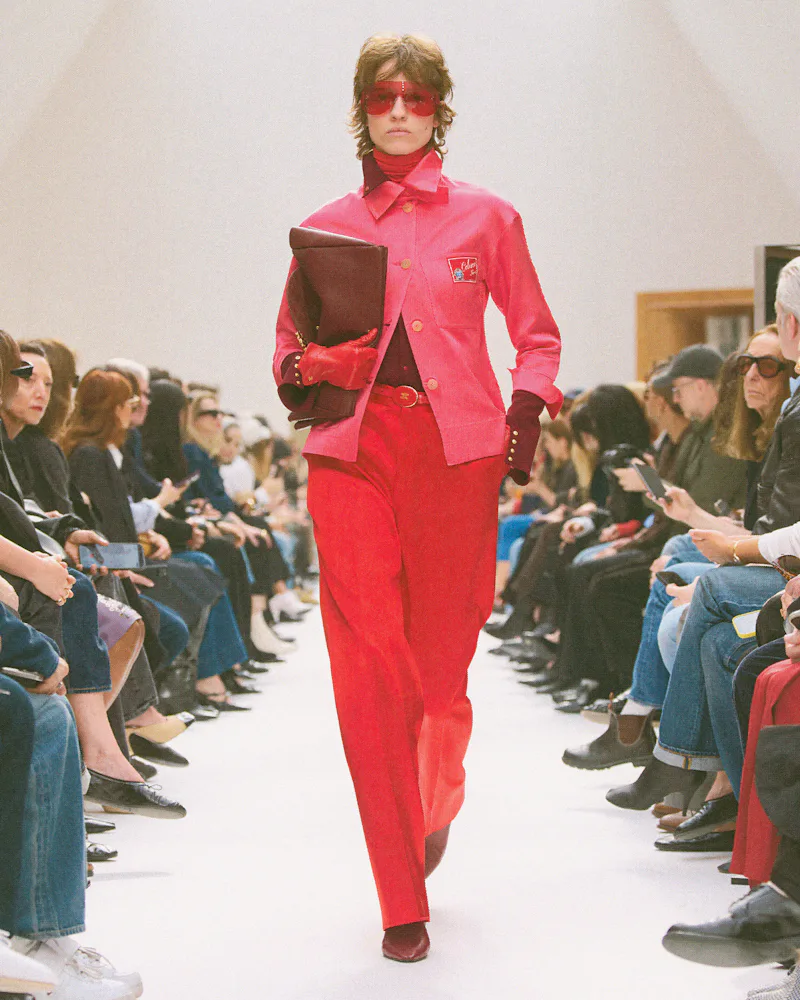
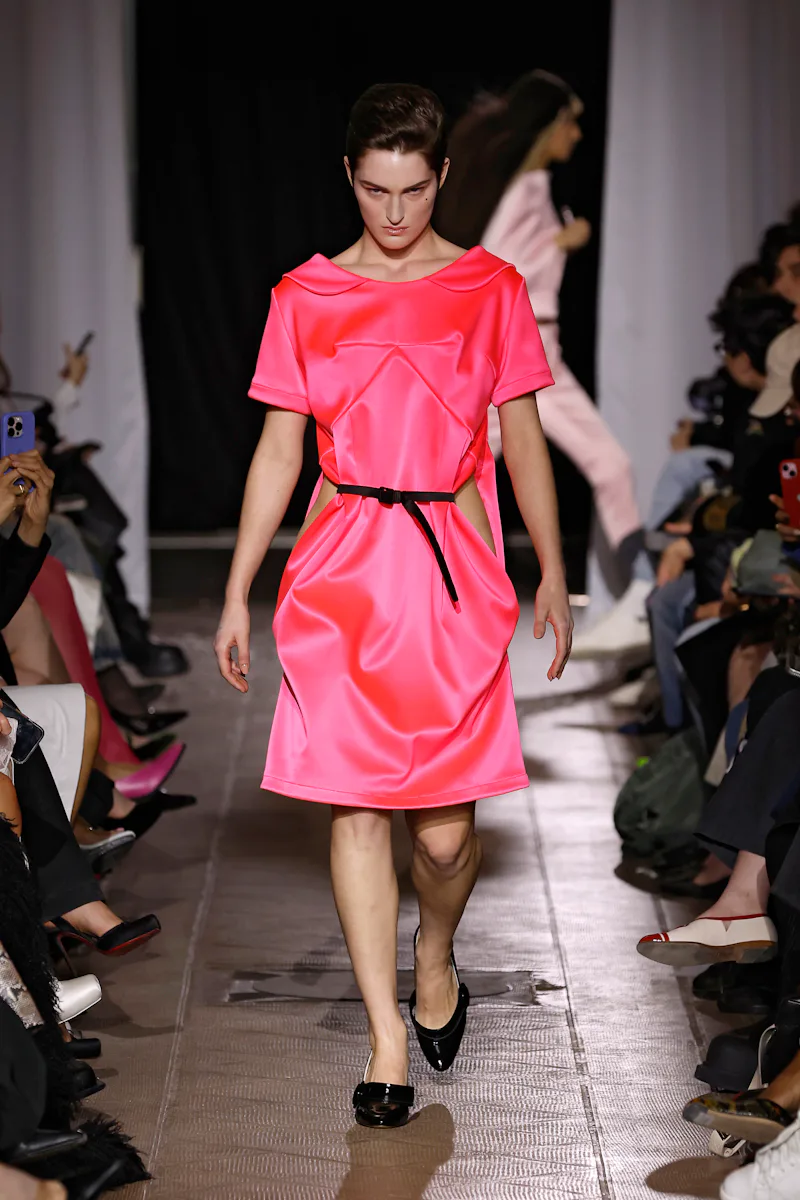
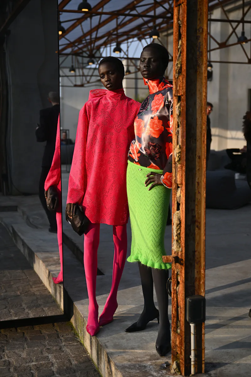
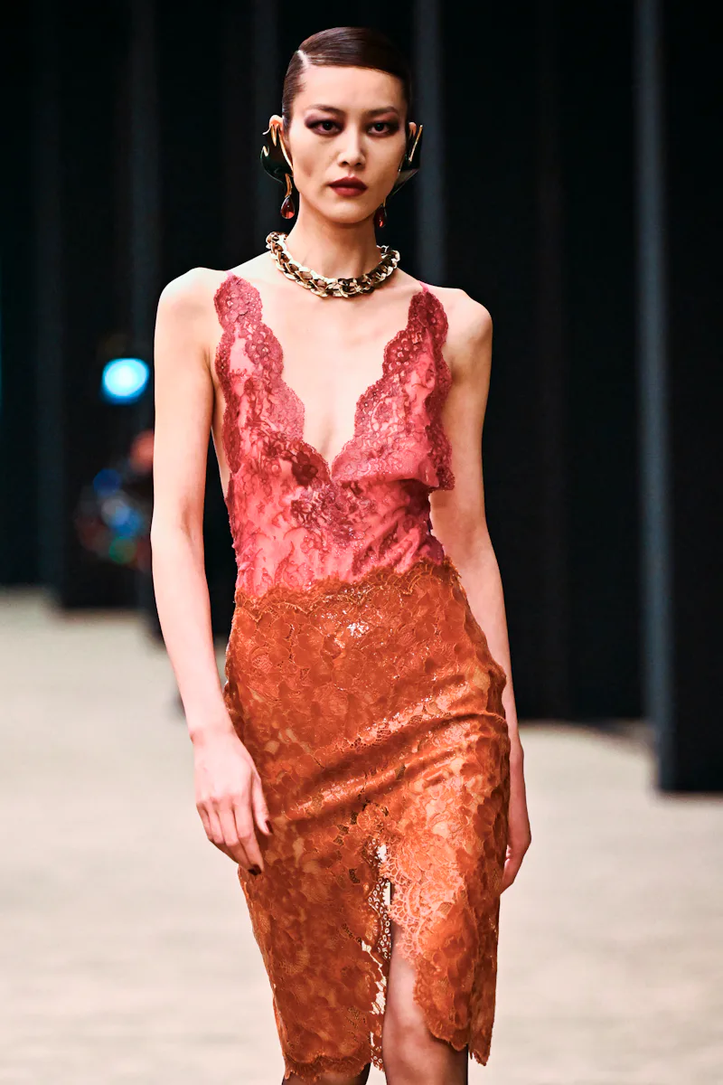
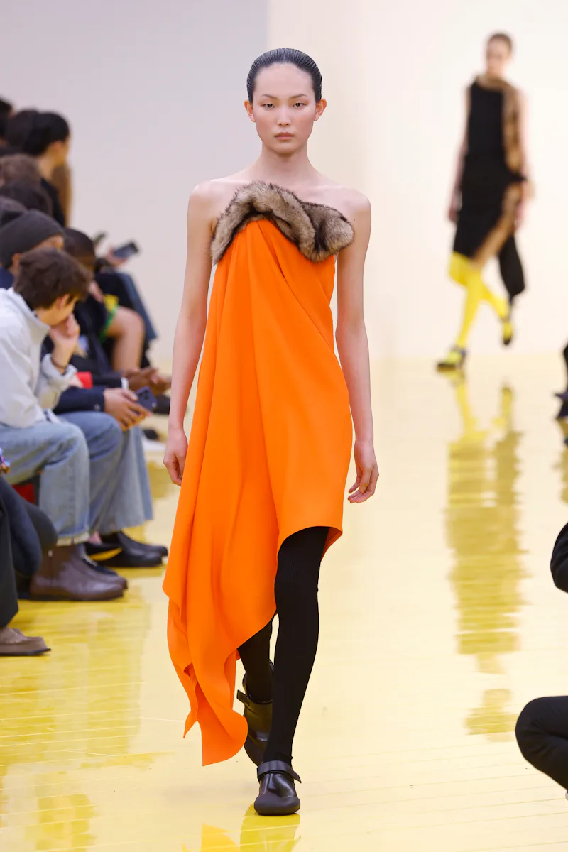
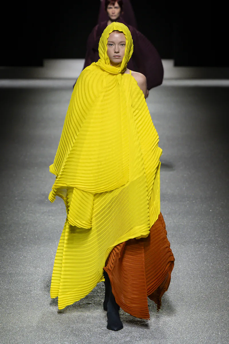
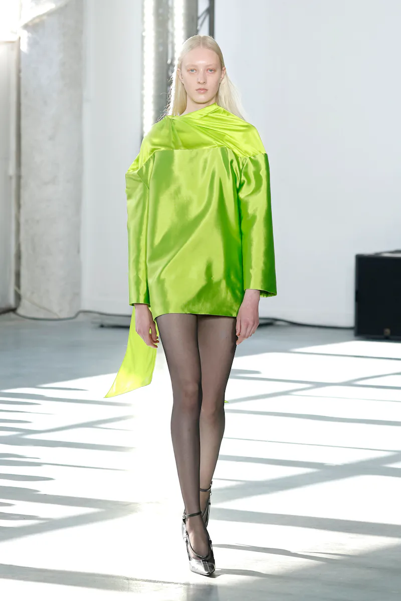
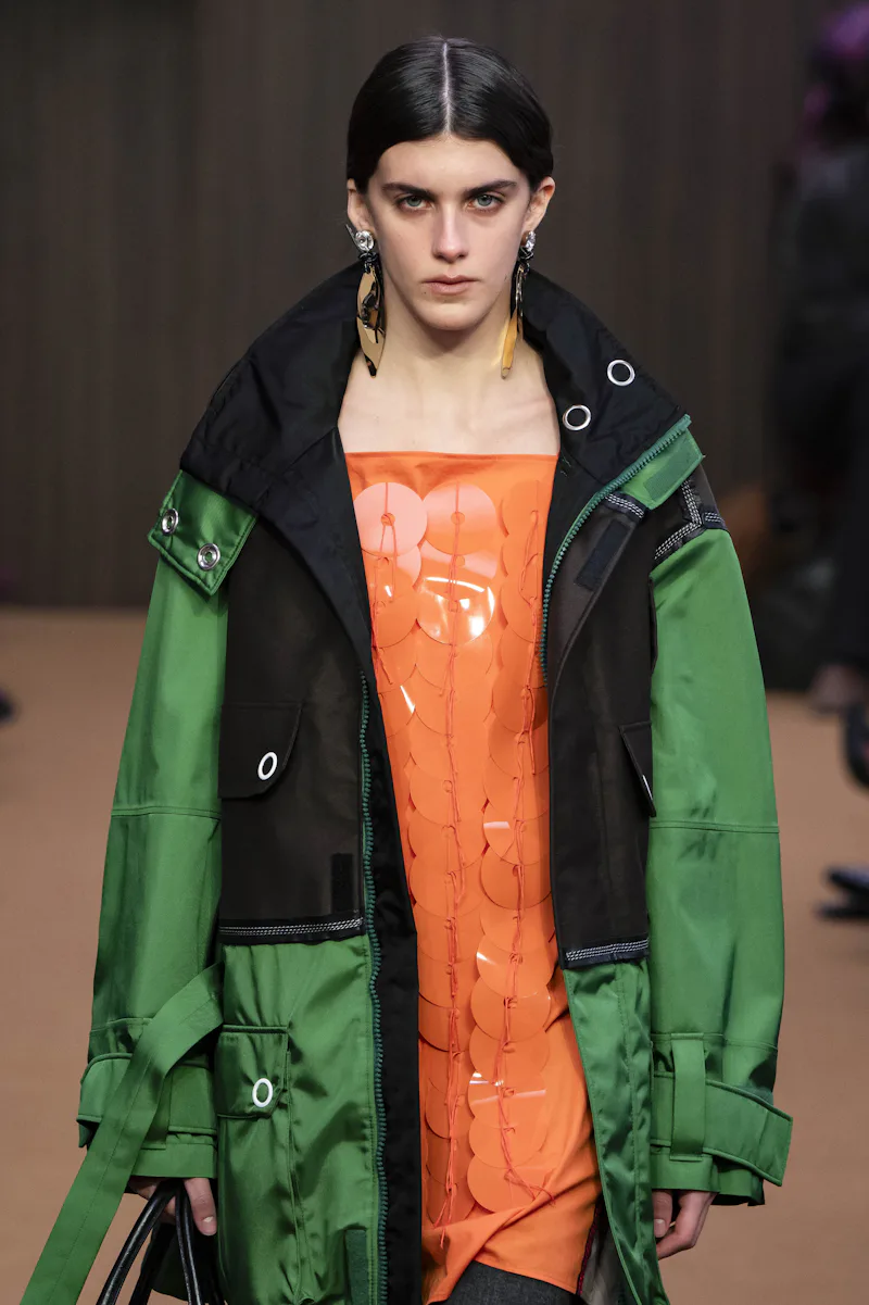
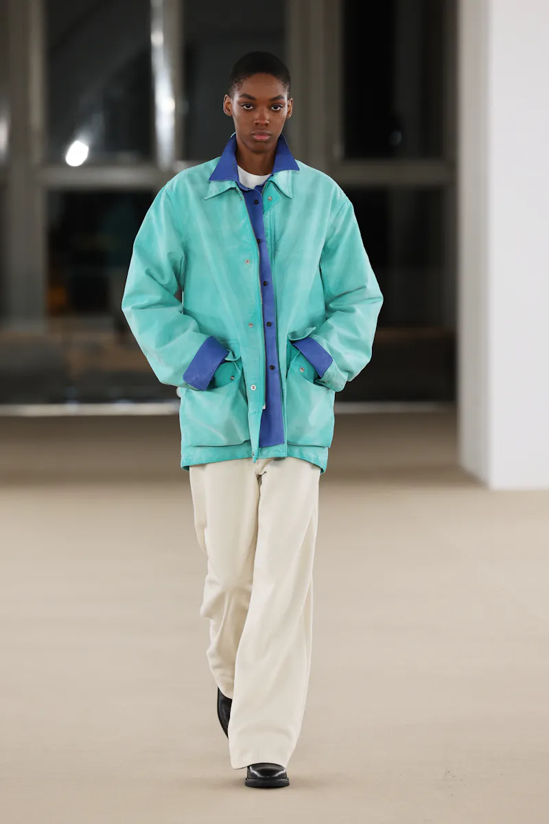
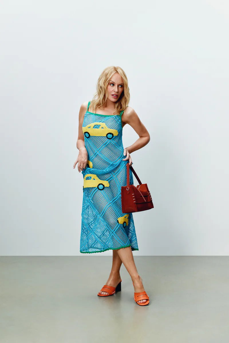
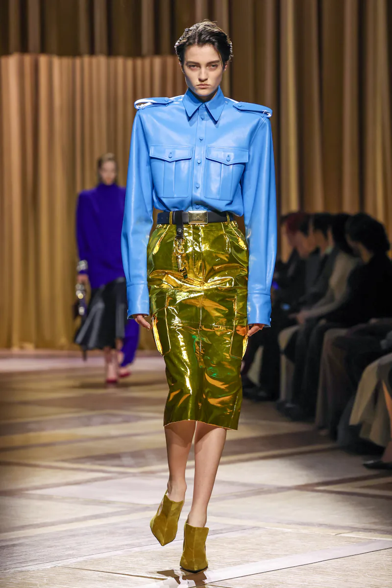
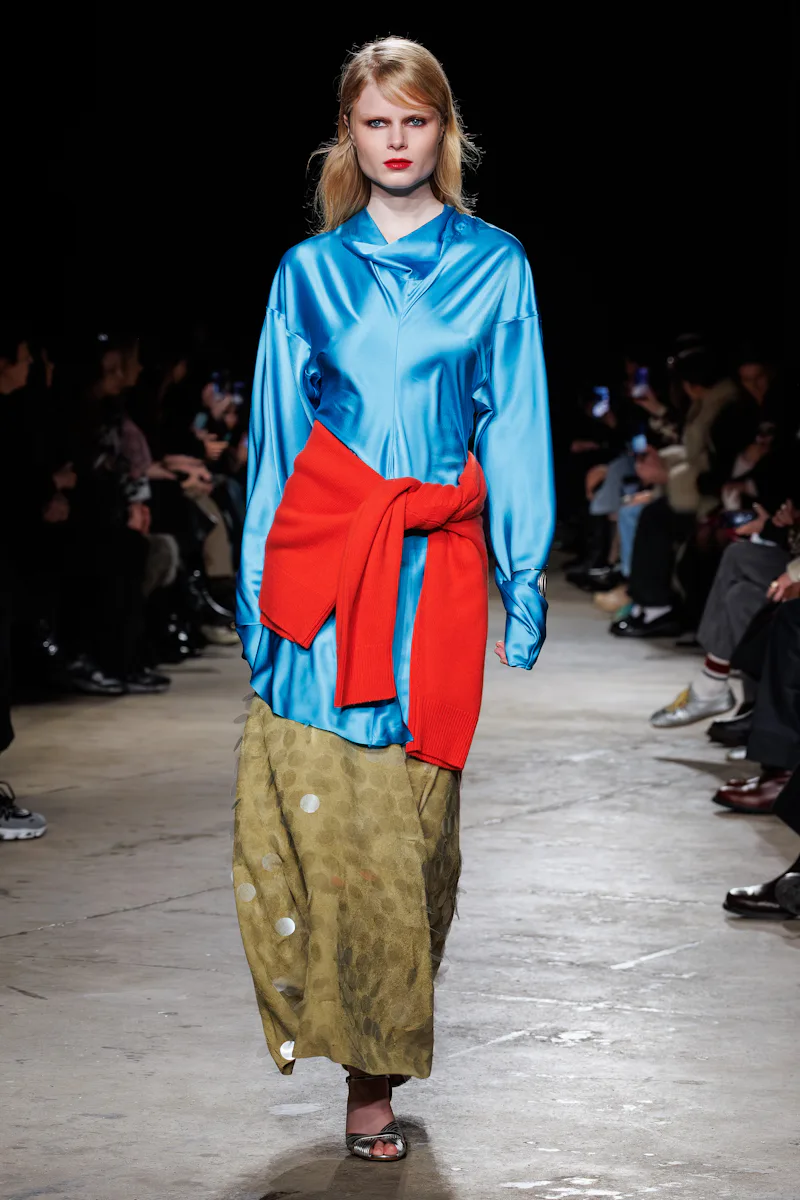
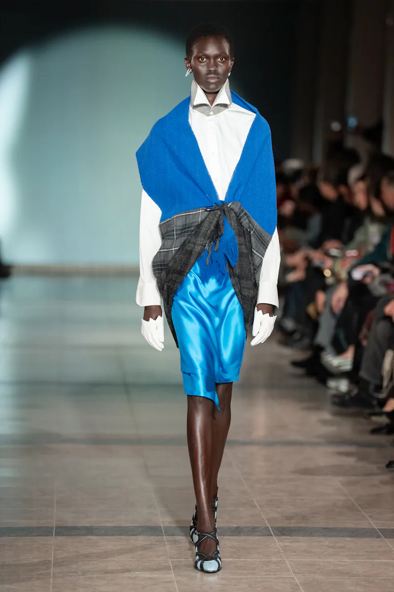
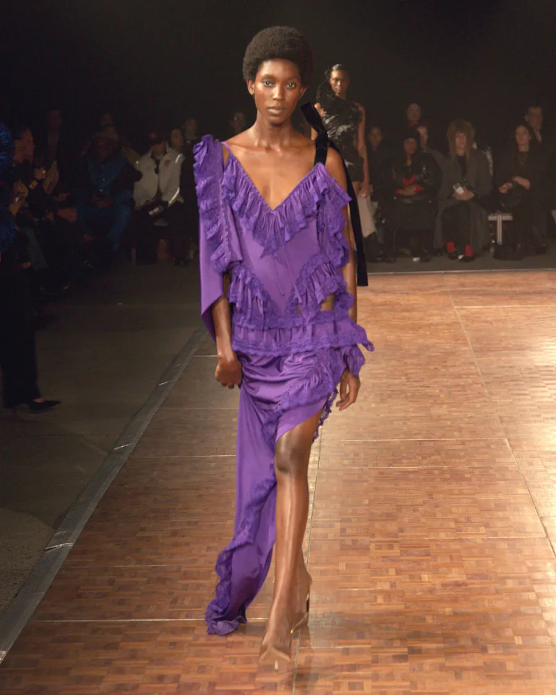
Lizzie Owens, the head of design at 6397, couldn’t resist the siren call of color: “Starting with Spring 2026, it became the thing I couldn’t ignore,” she says. “F26 worked the same way: turquoise, purple, peach announced themselves before concept, before the fabric. Something about 2026 was shouting for color.” The brand’s wide-leg denim, perfect shirting, and other wardrobe staples suddenly had an injection of mint, Pink Panther pink, and turquoise.
“Choosing a palette for something that won’t be seen for over a year is pure instinct, emotion, almost a sixth sense,” she adds. “You can’t overthink it, and it’s definitely not about subscribing to color trend reports or waiting on Pantone’s color of the year. You have to tap into something beyond the usual level of consciousness to feel it before you can even name it.”
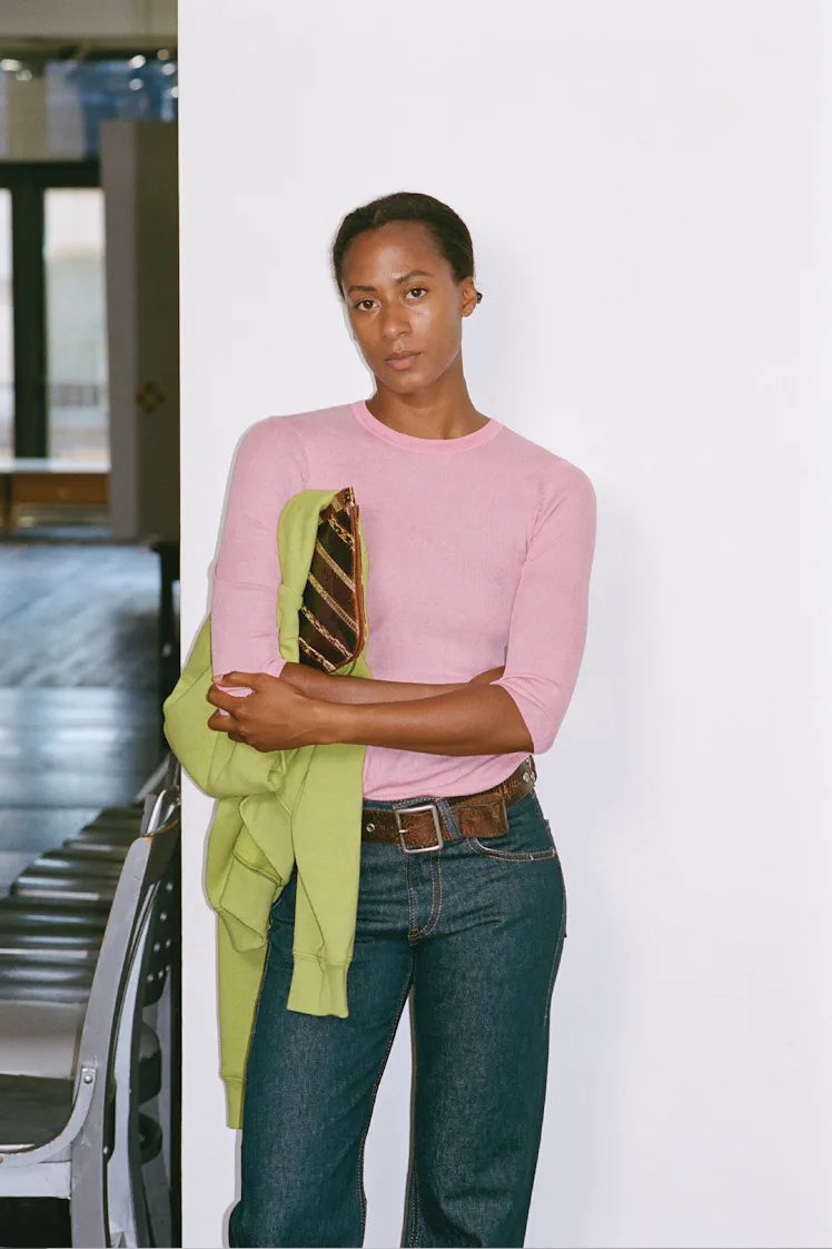
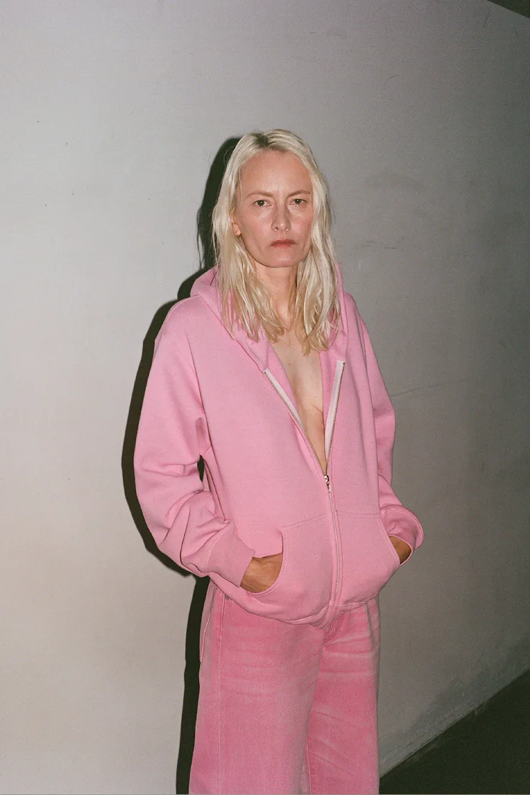
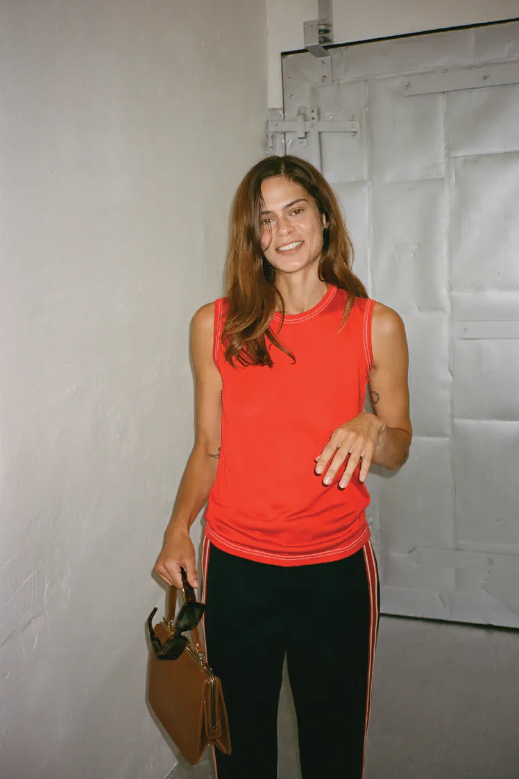
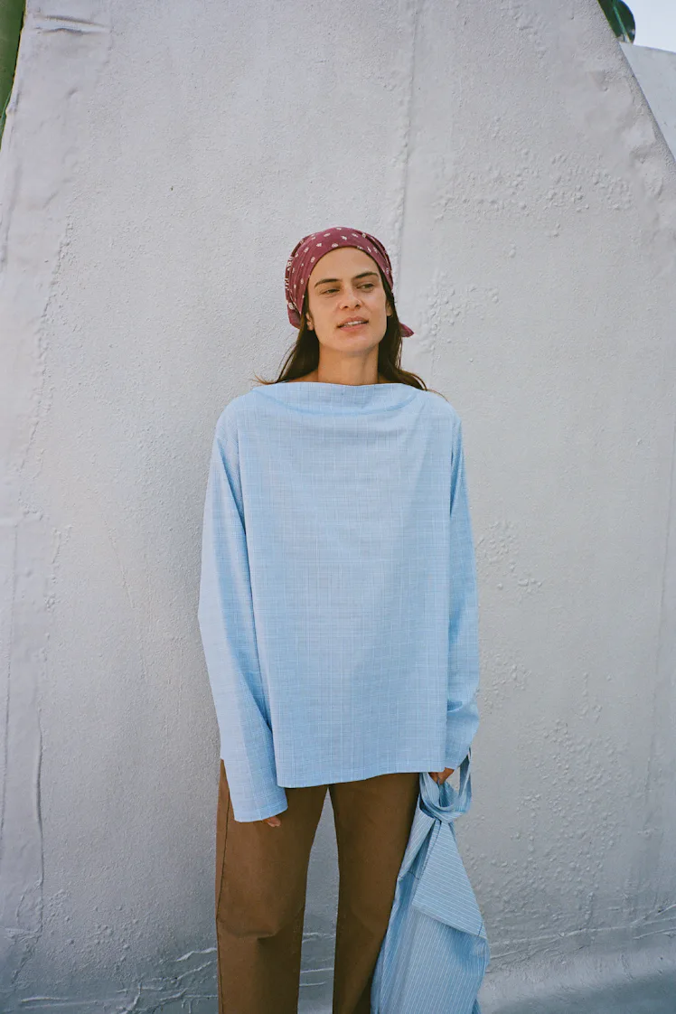
In Paris, color abounded, not just at the usual suspects’ shows like Chanel and Loewe, but in striking neon hues at Marie-Adam Leenaerdt and Mugler. Vaquera showed highlighter-yellow shift dresses, Saint Laurent’s muted palette even included hot red and orange paired together, and Issey Miyake’s Satoshi Kondo threw caution to the wind with a suite of neon trench coats that took up space and sparked a color revolution. The gist here is that color is the base of these outfits, not the accent: In fact, the more hues you can juxtapose, the better. Forget about a white T-shirt with a contrasting pant — the contrast could actually be a black bag now.
While we don’t expect to see Jenner wearing a full red-blue-orange look anytime soon, there are other early adapters in the mainstream that are setting the tone. Charli XCX has rolled out her most quote-unquote “goth” era yet, but she still wore a custom aqua-blue Chrome Hearts set for her “Wink Wink” video; in her “Rock Music” video, she also wore a custom version of the dress of Fall/Winter 2026: an eggplant-purple cinched minidress from 7 for All Mankind. Zara Larsson is a rainbow in human form, and her festival sets have seen her wear practically every Pantone shade possible. Solid, striking hues have also been seen on Pamela Anderson, Dua Lipa, and Hailey Bieber, the latter of whom made headlines for wearing a yellow lacy vintage top for a dinner — proof that addition of brightness into a wardrobe like hers is certainly worth reporting on.
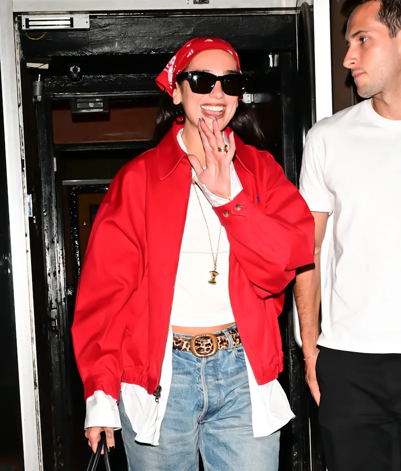
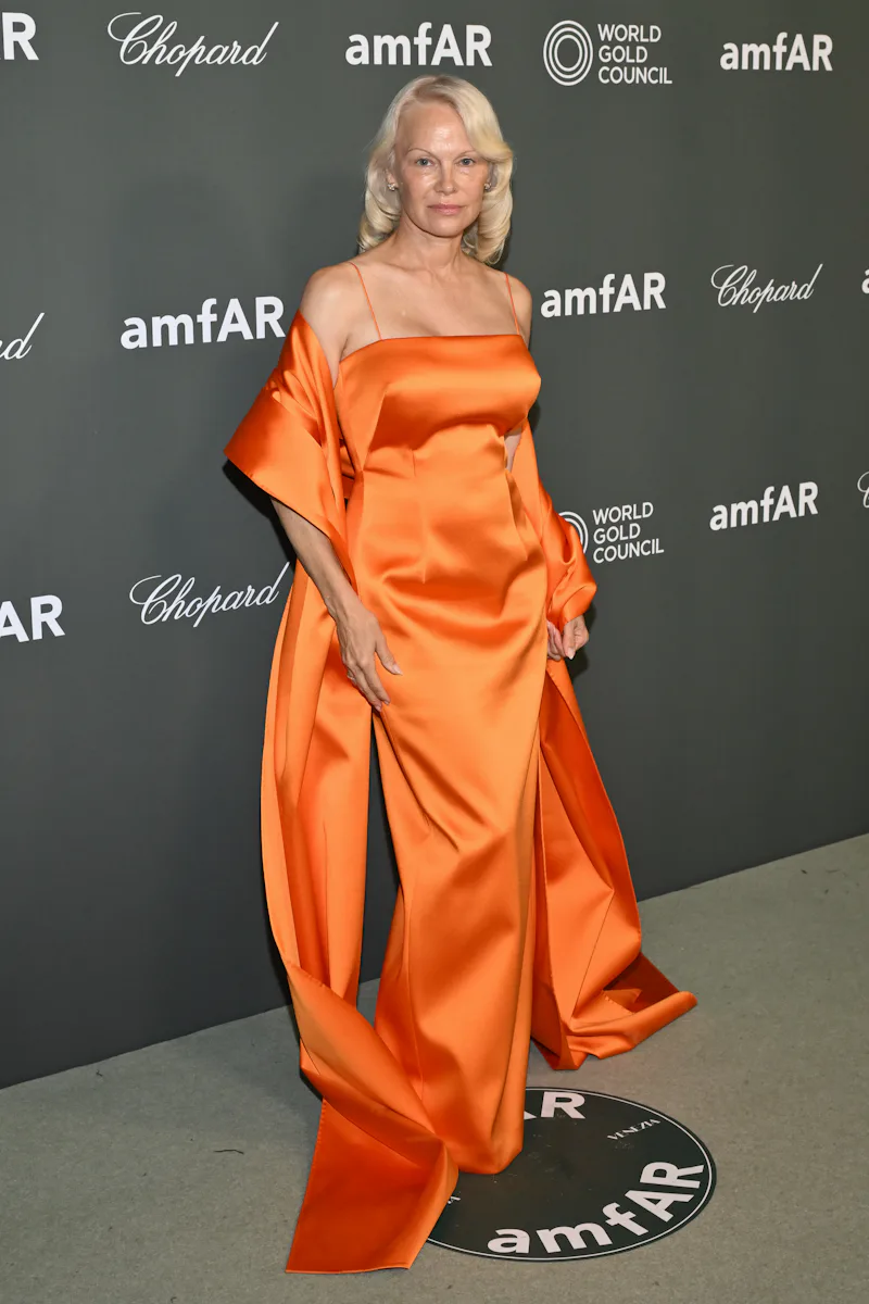
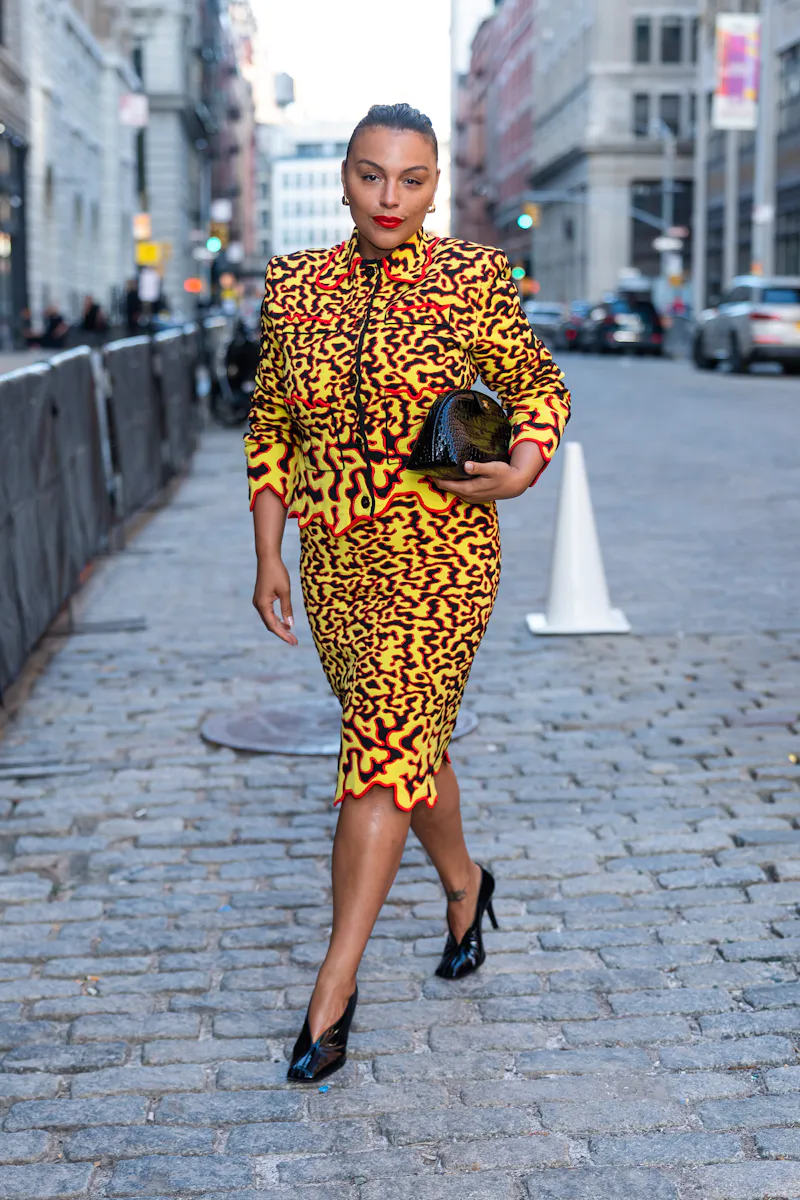
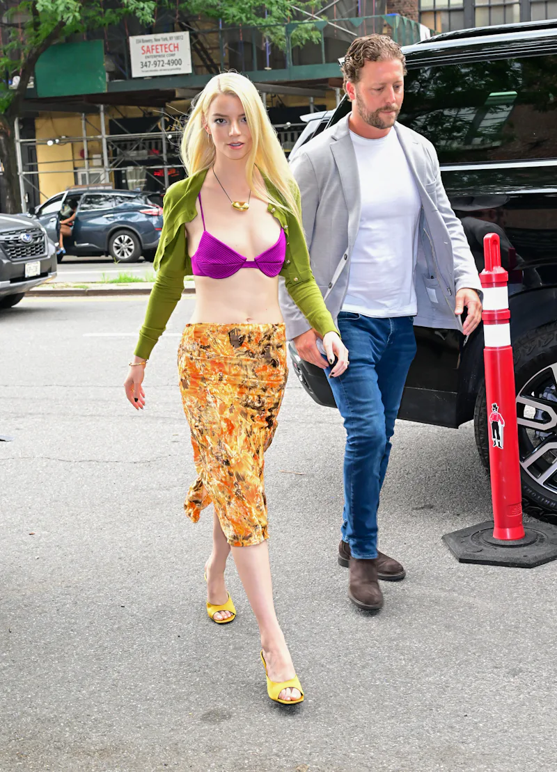
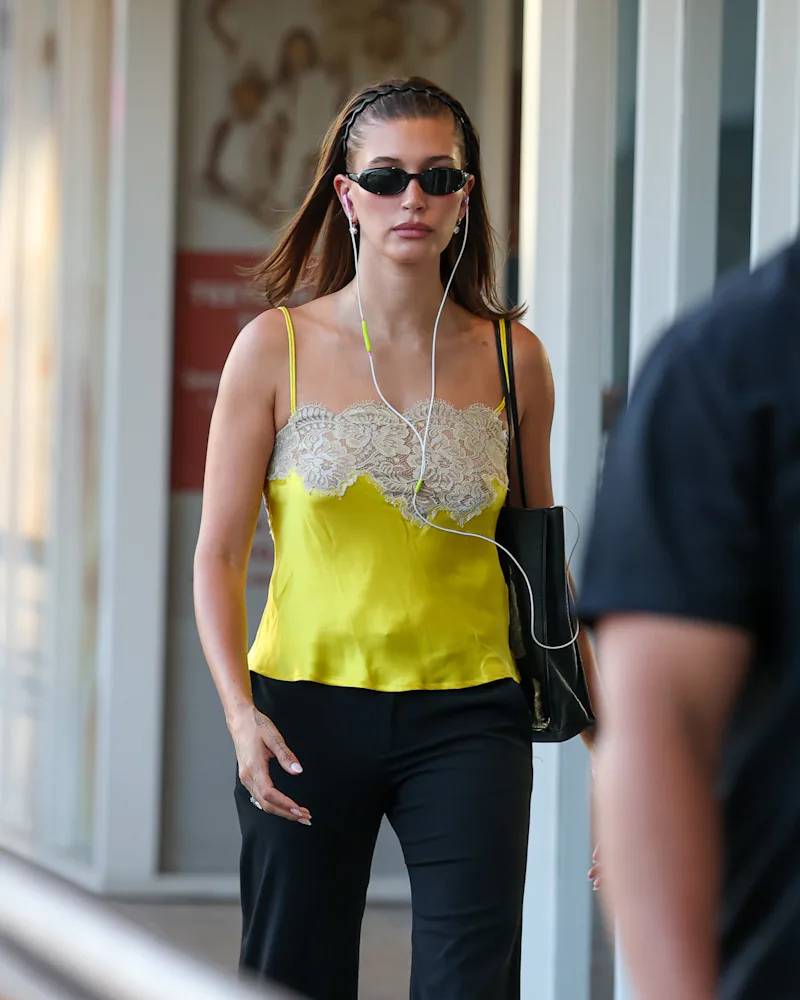
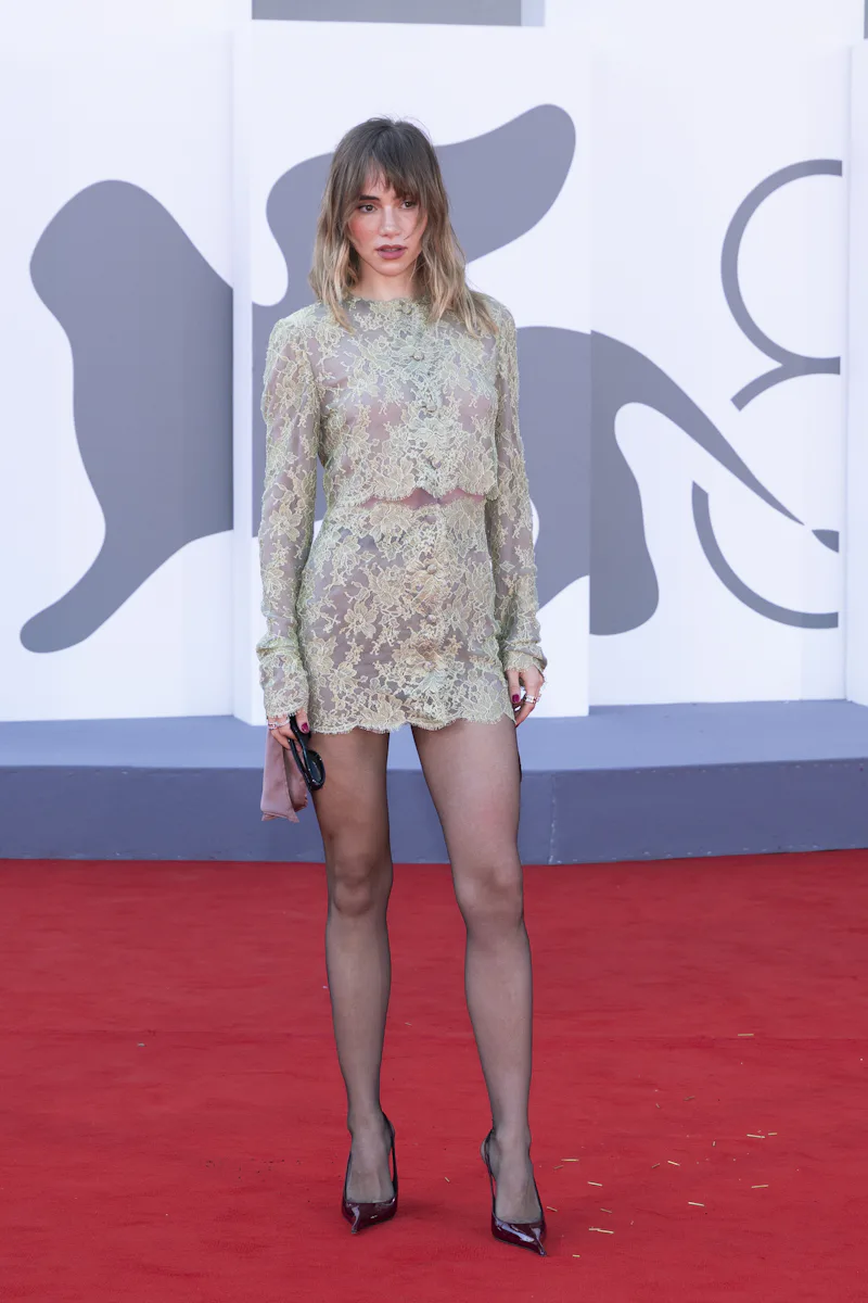
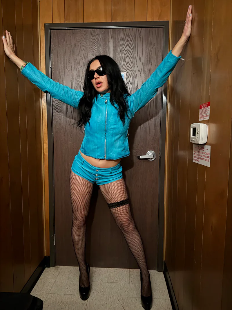
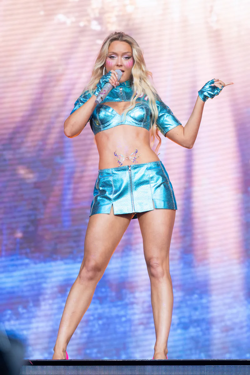
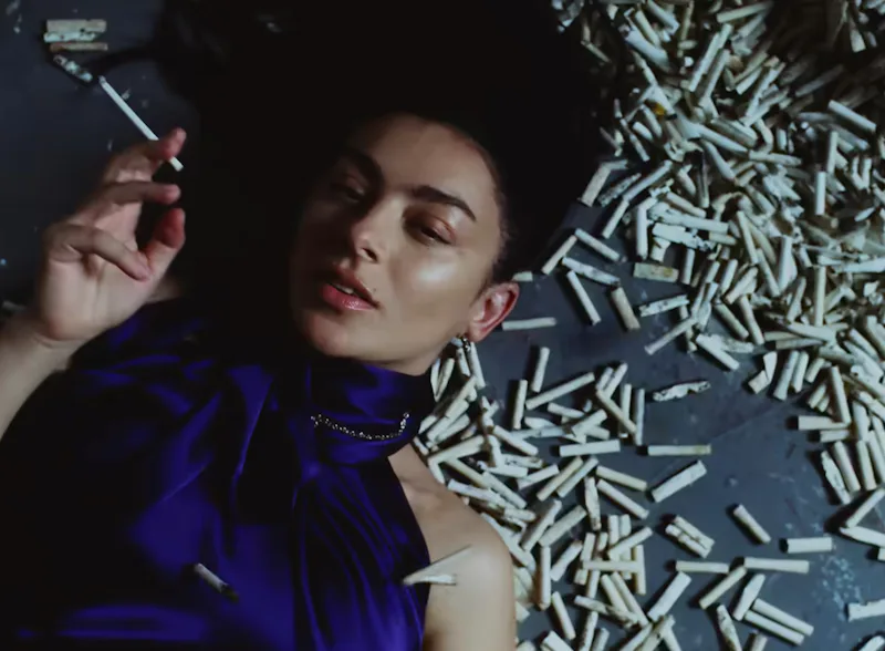
So how can you inject some saturation into your wardrobe? You could make like Bieber and find a richly colored top to wear — but we don’t think you should stop there. The season of color is about sporting monochromatic looks in Day-Glo shades, mixing and matching your three favorite colors that shouldn’t work together, and generally throwing caution to the wind when you’re getting dressed.
6397’s Owens agrees that it’s time to give yourself over to the rainbow craze. “I think we’re rebounding from a long ‘good taste’ era — quiet, luxurious, unapologetically wealthy,” she says. “The pendulum is moving toward creative expression, emotion, even messiness. And it’s not just a feeling — color theory backs it up. Our eyes and brains respond to color emotionally: Butter yellow calms you down; bright canary yellow excites you.” Finding the right harmony between colors is as much about the hues as it is about fabrics; mattes pair well with mattes, just as some gloss or shine can add a nice pop. What really matters is having fun and letting go — just like what Vitale taught us in his one instrumental season at Versace. The world is burning, so why not spice it up?
